
Clash of the Crystals Round One: Denver vs. TO
There's no doubt that Daniel Libeskind's architectural renovation of the ROM earlier this year drew a lot of publicity, good and bad. It was dubbed the Michael-Lee Chin Crystal in honour of generous monetary contribution of its namesake, and immediately had a polarizing reaction among those in Toronto. One Joe Clark went so far as to say the Crystal "sodomized" and "parasitized" the existing ROM architecture. So is the new ROM dramatic? Yes. Ambitious? Of course. Unique to Toronto? Well, turns out, not so much.
Apparently Mr. Libeskind has a penchant for erecting massive crystals containing priceless historical artifacts. His bio includes similar projects at the Jewish Museum in Berlin, the Imperial War Museum in England, and more close to home, the Denver Art Museum in Colorado.
So how do they stack up? In the first of a two-part series, I'll take a look at the exterior design of The Mile High City's crystal and see how our own humble children-hungry crystalline stacks up.
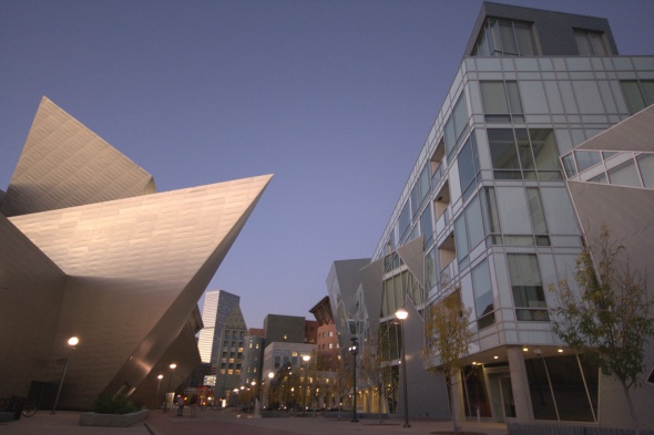
The first thing to make very clear right off the bat is that Toronto and Denver are very different cities. The GTA's population just about doubles Denver's metro area, and this is made very clear in the downtown core. Businessfolk bustle around the streets during the day, but more often than not, most streets seem just about deserted when night rolls around.
Denver also has some fairly revolutionary transit ideas in motion, making use of free hybrid diesel-electric busses that run up and the 16th Street Mall, a 16-block pedestrian/transit-only mall that makes up the retail core of downtown Denver. This system is heavily used by the public, and the busses are cleverly designed to prioritize standing room.
This forward-thinking is pervasive throughout the city. Walking through various parts of it, I was left with the impression that there's a municipal government that not only cares about the city's image, but is proactive in maintaining clean, well-designed streets with a pedestrian focus.
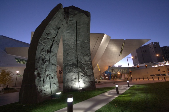
What does this mean for the Denver Art Museum? Well, approaching the structure you're immediately struck that it is all-encompassing, as if Libeskind was given near free-reign over the design and construction of the structure. The largest 'spike' on the crystal hangs well over 14th avenue, while the ROM's most prominent protrusion hangs just above the sidewalk. As many of you might also recall, Toronto city council went so far as to charge the ROM for using the public space above the sidewalk where the crystal protrudes into it.
Some would argue this measure was necessary for ensuring private-public space compliance, but to me this is an indication of artificial (and archaic) creative constraints.
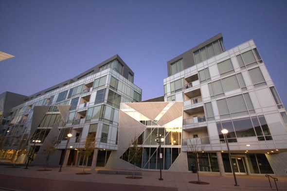
The other issue here is that the ROM feels completely out of place with its surrounding architecture. This isn't helped by the fact that much of the existing (beautiful) portion of the ROM is completely dominated by the heavily contrasting Crystal structure. At the site of the Denver Crystal, it is surrounded by architecture of equal post-modernist design, including the Denver Public Library.
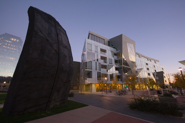
The surrounding area, stretching into nearby Civic Center Park, was given a high amount of attention to detail, and is lined with complimentary art installations, statues, all of which are illuminated by dramatic lighting at night.
While the same aluminum cladding was used in construction of the Denver museum, the distinct lack of black-outlined windows gives the structure a more consistent, and less cluttered appearance. It gives the impression that there is more confidence in the design of the Crystal itself, while not relying as heavily on heavily angular windows to give it distinction.
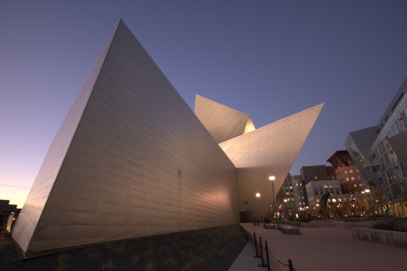
Obviously, the ROM has the advantage here of providing natural light for the interior of the museum, but this may have been a logistical choice to prevent the light from damaging priceless works of art in Denver.
So on the exterior front, who comes out on top? My vote goes to Denver. As much as I appreciate Toronto's introduction of post-modern design into a rather tired-looking neighbourhood, I can't help but shake the feeling that the implementation of the Lee-Chin Crystal is "parasitized", as Mr. Clark said.
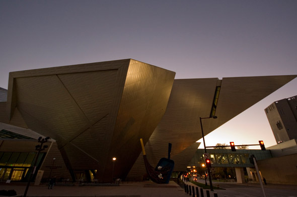
Denver's Art Museum leverages the surrounding beautiful, complimentary architecture to create a striking building, from every perspective. The level of detail given to the surrounding landscaping, illumination, and pedestrian-friendly areas in the Civic Center give it a welcoming feeling, as well as one that feels as though it conveys the original design inspiration.
In the coming weeks, I'll take a look at the interior of both of these structures in an attempt to show if Denver's good design sense translates into good use of interior space.
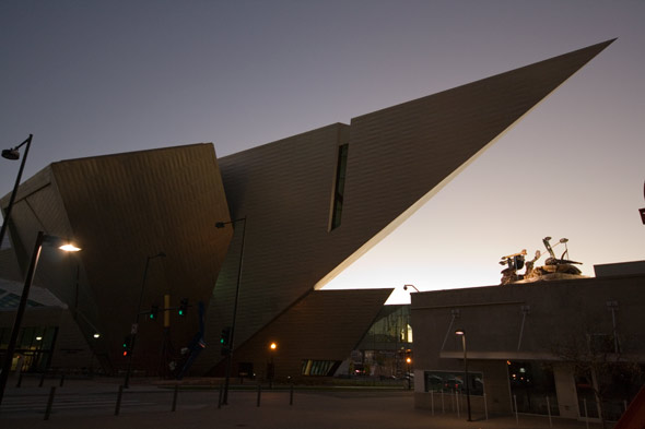
All photos by me. Check out some more shots of Denver's Art Museum.
Latest Videos
Latest Videos
Join the conversation Load comments


