
Nuit Blanche 2010: The best and worst of Zone A
Nuit Blanche is many things: funny, surprising, charming, exhausting, annoying, frustrating. This year was no different.
What I had forgotten about before set out to experience Zone A was its crippling problem: the crowds. Many people who do not live downtown start at Yonge and Bloor and spread outward. This means that Zone A is the Land of Lines. It's like a more frustrating, nighttime version of Disneyland. It's exciting to see so many people interested in art, but I feel like the organizers gave little thought (once again) to how annoying and draining it can be to wait in line for longer than ten or fifteen minutes. By the end of the night, I had worn out my joke, "This isn't a line up, it's an installation!"
Nevertheless, after some searching and waiting, I found some bright spots. I initially planed to come up with a list of ten favorites of the night, but after nearly six hours on my feet, I could only come up with five for Zone A. But one of the five was an overlooked gem, so I think it was worth it. Almost.
Here's my list of what I did like (in roughly chronological order of when I saw it):
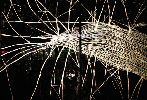
The focus at Nuit Blanche is usually on technologically based installations which try to impress with their technical know-how. This piece just had a nice idea with some hard work - and it didn't have a line up! Artist Nadine Faraj painted the exterior glass wall of a retail space in black paint, and then began scratching away the paint to produce patterns. Light from floodlights shone through the cracks, and Faraj altered the image through the night. The result was simple, but its lack of cutesy pretension and its DIY spirit were refreshing in a Zone dominated by art big on technology and low on ideas.
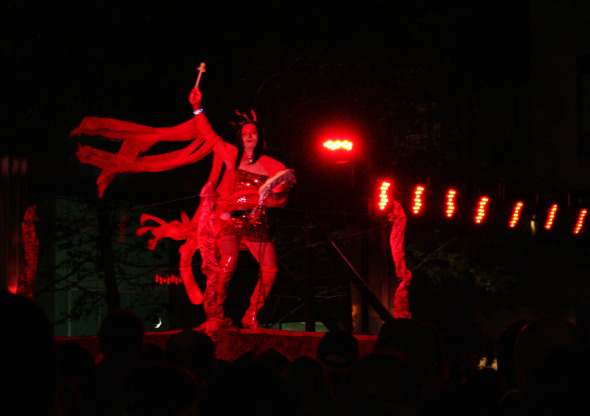
There was a lot of waiting and the performance was over almost as quickly as it started, but Kent Monkman (aka Miss Chief Eagle Testickle) was another refreshingly different project. In Monkman's case, it was a welcome change to see a person being the focus of attention rather than a flat-projection-of-light-as-art. The idea for the piece didn't seem incredibly thought out - why was Miss Chief wearing a spangly red dress? - but its entrancing electronic drumming patterns, coloured lights and general wtf-ness were appealling.
I should also note that some turds behind me made homophobic comments during the performance. But I figure this is a sign of the piece's success: it confronted people with things they may feel uncomfortable with. Drag queens may be old hat for many people, but for some, they still push buttons.
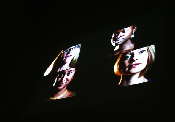
Twenty-nine singers sang in different languages to produce a choral work. A projection of them singing was thrown onto a wall of The Spirit House in the ROM. The images of individual singers would vanish or reappear depending on whether his or her voice was being added or taken away. The installation had a bit of a cheesy Benetton ad vibe to it (look at how diverse we are!), but the work was saved from being ridiculous by the quality of the music the singers produced. Hearing individual voices - with all of their various inflections and defects - combine to produce a song is nice in any context, but having it so clearly delineated intensified the effect.
Seed Rotations
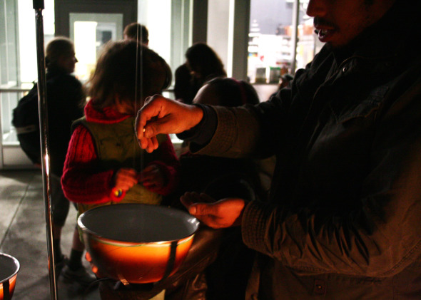
After deciding to get away from the crowds, I escaped to Toronto Artscape's Wychwood Barns, which was still technically Zone A. It was a brilliant idea. Wychwood Barns' installations were inviting, intriguing and relaxing. They also gave you bang for your time: the Barns had three officially listed installations and a couple of unlisted installations.
Helen Verbanz's Seed Rotations was one of the unlisted installations. Several hanging pots were hooked-up to a sound system. As visitors dropped seeds into the pots, the seeds created a satisfying, plunky accompaniment to a prerecorded melody. The installation was nothing ground-breaking, but the informal atmosphere of the installation encouraged participation and conversation among the people participating. Little kids joined in. It felt exactly like what Nuit Blanche aims for and rarely achieves: the free and fun interaction between artists and the public. It certainly helped that Verbanz was cheerful and unpretentious.
Abilities Arts Festival & Theatre Direct - Mirage
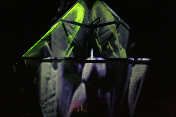
My favorite for the night. While we were watching the performance, I said to my friend, "This feels like the first art I've seen tonight." The performance involved two stages. In the first, you were encouraged to engage with three mirror-based perceptual illusions that centred on ideas of symmetry and identity. All of them were genuinely startling and surprising.
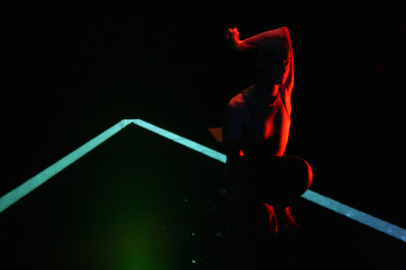
The second part of the piece involved a dance performance that built on these illusions and the experience of the performer, James Cunningham. In 1992, Cunningham nearly lost the complete use of his left arm. To deal with the pain, he used some of the mirror techniques we had tried out in the previous room. His performance focused on this loss, and how illusions of symmetry helped heal him. WIth one arm clearly thinner and less functional than the other, the performance - featuring multiple projections of Cunningham, a shallow pool of water and an inventive, electronic-based soundtrack - can only be summarized as intense and unforgettable. Personal, immediate, complex: it was the only Nuit Blanche installation I would have paid money to see.
As with any Nuit Blanche experience, there is always a lot to criticize. Zone A, being a fairly populist zone, had its fair share of stinkers. Here's my list of the worst of the night.
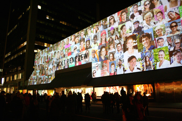
The worst installation in Zone A. Too often Nuit Blanche falls into the habit of equating projected light with art. The snapshots of people smiling on Holt Renfrew looked like an advertisement for a photofinishing place. Clearly this installation was a way for Holt's to get thousands of people to take pictures of their building without saying anything remotely offensive. There was even a smiling face inside their "O." When the saccharine, pandering sounds of Michael Jackson's "Smile" started playing, I had to leave.
It's a shame, really. Holt's is known for its great window displays: its homage to Grace Jones's "Nightclubbing" remains one of my favorites. Too bad they couldn't have encouraged that saucy flare in this art installation.
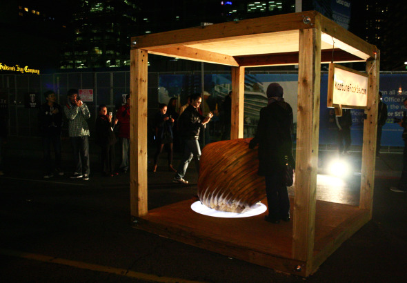
If the light = art issue is at the heart of many of Nuit Blanche's problems, KortuneFookie represents another way to put no thought into an installation: art = simple transaction. I'm not sure what lining up to push a button and get a fortune is saying. Personally, I think the food stalls behind the installation had something more delicious to say about transactions.
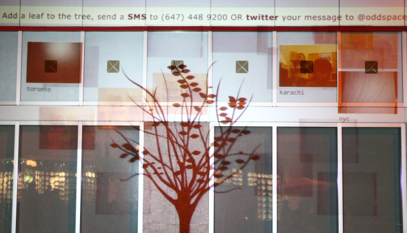
Odd Spaces encouraged people to text to a particular phone number to add leaves to a virtual, projected tree. But have the creators of this installation never seen TXT TV? How is texting with other people you don't know groundbreaking or different? This one also felt crassly commercial. As it was projected on the wall of a Scotiabank, it was hard to keep the logo out of your photographs.
Lead image: Ephemera (2010), Nadine Faraj, courtesy of the City of Toronto.
Latest Videos
Latest Videos
Join the conversation Load comments


