
OCAD unveils its new brand identity
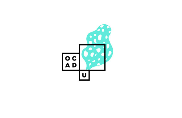
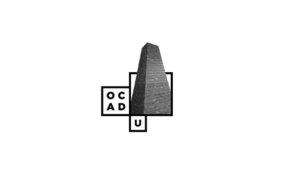
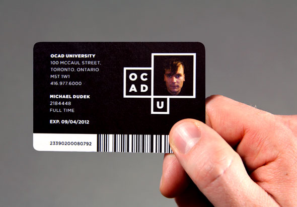
A nondescript brown box arrived at blogTO headquarters yesterday. Inside was a large white shirt, a black tote and a bunch of brochures. What did they all have in common? They were all emblazoned with OCAD's new logo - you know, the one designed by Bruce Mau Design, the same firm responsible for the AGO's new look.
According to the press release sent our way, the new identity was arrived at "through a process that included interviews, workshops, questionnaires, leading classroom discussions and social media - all with the goal of engaging participants and extrapolating the stories and spirit of OCAD U."
So did Mr. Mau earn his paycheck on this one? We want to know....Take our Facebook poll.
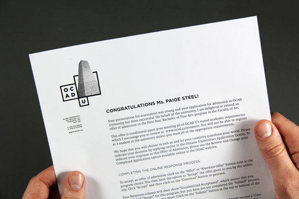
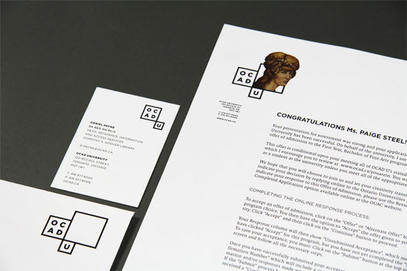
Here are more images of the new brand identity plus an excerpt from the press release.

From the press release:
Inspired by OCAD U's iconic and transformational Alsop-designed Sharp Centre for Design, BMD created a base of black and white pixel 'windows' -- modular frames to hold actual student art and design work. Through these 'windows' the core of OCAD U is presented - conceptually strong, relevant, diverse, and compelling. "As we push the boundaries of art and design practice, education and research, so too does our new identity, giving the world a window into what we do here," said Dr. Diamond.
The identity is dynamic and modular in design. Every year, graduating student medal winners will be invited to design a logo within the basic window framework, providing the university with a set of logos for that year. As OCAD U grows and matures, a living library of identities will emerge, recording the ideas and aesthetics that have shaped our culture over time.
Latest Videos
Latest Videos
Join the conversation Load comments


