
Nathan Phillips Square Re-Designs Revealed
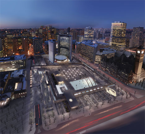
Night Overhead by Rogers Marvel Architects
Last night I attended the presentations made by the four design teams competing for the delicate and symbolic task of redesigning Nathan Phillips Square. I arrived early to get a look at the mock-ups and speak a little bit with members of each team, and a few common themes were quickly apparent.
Each team approached the challenge with a great deal of respect for the importance of the square to Toronto's civic identity and an enthusiasm to engage with the architectural language of Viljo Revell's original design. They all strongly emphasized the sustainability of their projects and focussed on the green aspects that would make the square an appropriate space for the 21st century, especially in a city striving to be the greenest in North America. In that sense each team has entered a successful and strong bid for the prize of re-designing the square, and, as is always the case with design competitions, each entry has its strengths and weaknesses.
The image at the top of this post is a night rendering from Rogers Marvel Architects' submission, but I'll begin with a description of the submission by Baird Sampson Neuert Architects. I should note that my descriptions don't discuss every element of each proposal; each was so detailed and complex that it would be impossible to fit the entire two-hours of presentations into one post. Having said that, here's a summary of what I consider the highlights:
Baird Sampson Neuert Architects
The most dramatic element of this submission is the re-imagination (and relocation) of the Peace Garden. In this proposal the Peace Garden moves to the western edge of the square and virtually doubles in size. While the garden keeps the eternal flame and reflecting pool from the original, it adds several new symbolic dimensions. A sculpted landscape slopes up from Queen Street and provides a raised lookout at the same elevation as the colonnade (the elevated walkway the surrounds the square). In the middle of this lookout is a hole through which a camphor tree grows, a reminder of the only tree that survived the bombing of Nagasaki. You can see this element of the Peace Garden on the bottom-right of the image below.
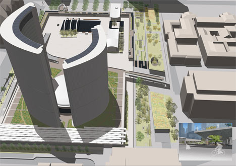
Another notable feature of this submission is the addition of several minimalist buildings. One is meant to replace the current unattractive skate rentals building and another actually straddles the colonnade, housing a restaurant and reaching almost to the sidewalk on Queen. A third building on the south-eastern edge looks like a dwarfed and squished-together version of City Hall itself, and is meant to serve as a welcome centre to the space.
While I like the new symbols in the Peace Garden and the increased green space on the western edge, I'm not crazy about the new restaurant building. The building itself isn't unattractive, but it feels like it clutters up the entrance to the square a little bit. I do like the welcome centre on the eastern side, especially the way it mirrors the older building it introduces.
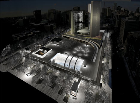
The submission by Plant Architect Inc. is probably the most environmentally conscious of the four. Dubbed the Agora / Theatre proposal, the designers drew inspiration from early Greek public spaces which asserted that public squares were theatres for the public life of the city. Early in their presentation they made it clear they were striving for no less than a LEED Gold certification in their design. Features like benches warmed by excess energy from the underground parking lot show they put a great deal of thought into making sure energy was used in as efficient a manner as possible.
Like other designs, they suggest new landscaping on the podium (where the council chamber sits) and a new restaurant building, this one on the south-western corner of the site. Other than the high environmental standards, my favourite element of the proposal is not actually in the square itself, but in City Hall itself. The 27th floor of the east tower contains a closed observation deck that remains largely inaccessible, even to the most intrepid explorers. Plant Architects Inc. propose a refurbishing and re-opening of the deck so that citizens might look down on the newly re-designed square.
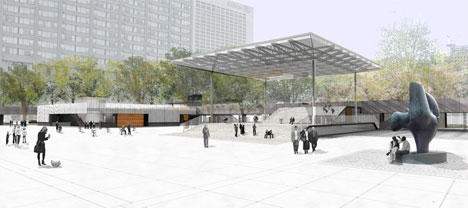
Yet another addition common to all submissions is the presence of a stage for the programs and concerts that take place in the square. In this submission it functions not only as a stage during performances, but also as a sheltered walkway that leads up to the colonnade during quieter hours.
The strength of this submission is its emphasis on being environmentally friendly, and, because of this, I'm sure it will be one of the more seriously considered proposals. The re-opening of the observation deck is also an admirable detail, and goes a ways towards integrating the building itself into the redesign.
Zeidler Partnership Architects
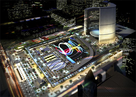
This is probably the most dramatic submission, both in terms of experimentation and flash. On the western edge of the square are a series of "undulating waves" with different landscape features on them. The rest of the square (including the podium) is filled with dozens of movable tree planters which emit light and can be spread around the square like paint on a canvas. Mounted on the top of City Hall's towers are two projectors that project images like maple leaves or graffiti collages on to the space in front of the building.
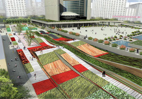
At night time the square is animated with layer after layer of lights, giving it an LED glow to make it a warm place 24 hours a day. My favourite feature of this proposal suggests that the ventilation grate that now forms a physical (and smelly) barrier at the southern end should be removed. On top of the grate several 6-metre tall lights will glow different colours as the exhaust channeled through them and is released well above the sidewalk.
While I like the effort to make Nathan Philips Square a dramatic space, I think this proposal is guilty of a little overkill. I like ambient lighting - a lot - but layer upon layer upon layer of it makes the space a bit more flashy than it's supposed to be. Some of these elements would be a huge improvement over at Dundas Square, but in front of City Hall they seem inappropriate and overwhelming.
The proposal seems to copy some elements from West 8, the winning design team for the central waterfront (the giant maple leaves, the light projections from the CN Tower, the undulating slip bridges). Still, the paint-and-canvas idea and the mutability of the space create limitless design possibilities, which would ensure that the area was always an interesting one to enter.
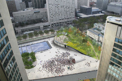
The Rogers Marvel submission seems to combine the drama of the Zeidler entry with the quiet dignity of the Plant Architects' submission. What struck me - and likely everybody else who saw the mock-up of this proposal - was the addition of a hill on the western edge of the square. The hill serves multiple functions: it rises to the level of the colonnade, making it possible to walk from street level up to the platform through an urban wilderness. Creatively housed underneath the hill are the skate rental facilities, a restaurant, and even a stage that can be pulled out and slid back as the occasion requires. The hill also serves as an amphiteatre for smaller performances.
Another surprising feature about this proposal is the removal of a piece of the eastern portion of the colonnade, a gesture that will likely raise the ire of purists who don't want to see any part of the original structure demolished. The motivation behind this is to open up the eastern side of the square to make it more accessible from the east side, an aim I think is worth the loss of some hovering concrete.
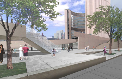
Part of this effort to open up the eastern side is the relocation of all the flags from the Bay Street side of the square to Queen Street. The flags will not only line Queen Street in front of New City Hall, but also continue east and stand in front of Old City Hall, turning Queen into a grand avenue of civic importance and linking the two City Halls together.
Of all the submissions I like this one best. The addition of sloped landscaping not only drastically increases the amount of green space, but also manages to combine the need for natural settings with a restaurant and the skate rental facility. It combines the some of the best elements from the other three proposals but also adds its own unique touch.
At the time of this writing the submissions weren't available online yet, but they should be on the site for the competition soon. To see more renderings, head on over to the Spacing Wire, where all the images given to the media are available in high resolutions.
Each design will be on display in the rotunda of City Hall until February 26, at 10 p.m. You can provide feedback on each and all of the designs either by filling out comment cards at City Hall or heading over to the competition website. The winner will be announced in City Hall on March 8.
Images by the respective design firms, courtesy of the City of Toronto.
Latest Videos
Latest Videos
Join the conversation Load comments


