
Is Toronto beginning to overcome its fear of colour?
Toronto's architecture is considered relatively colourless. As Daniel Liebskind has said, "Toronto has some really grey buildings." In the winter the situation gets worse. But for fans of colour, there are encouraging signs that some bolder choices are creeping into the cityscape.
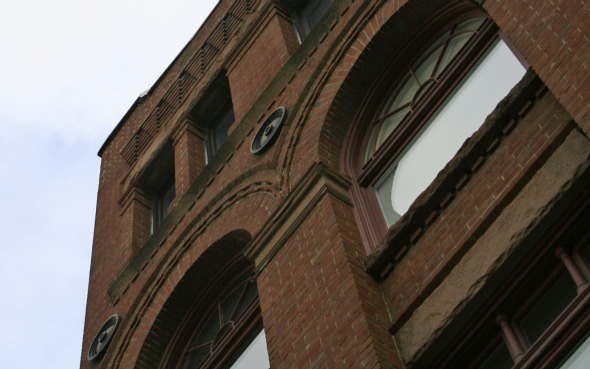
First of all, a caveat: Toronto is not without colour. What people tend to forget is that Toronto's 19th century buildings were largely built from red bricks produced from the Don Valley Brick Works. Along with the yellow bricks common to Southern Ontario, Toronto's original palette was very earth-toned, but had definite and appealing colour variations.
In the 60s and 70s, the concrete revolution added browns and pale beiges to this palette. In the 80s, mirrored office buildings introduced blues. With the rebirth of modernism in the 90s, gray steel and black brick have become popular. The result of all these trends is, when you consider it, a startingly varied palette.
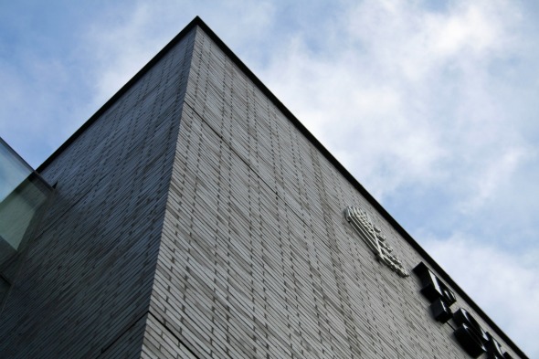
Although people say that the city is colourless, what they really mean is that the city is largely composed of neutrals: brown, grey, beige, rust, blue. They are colours that look pretty much the same if they are dirty or if they are clean. Compare, for instance,
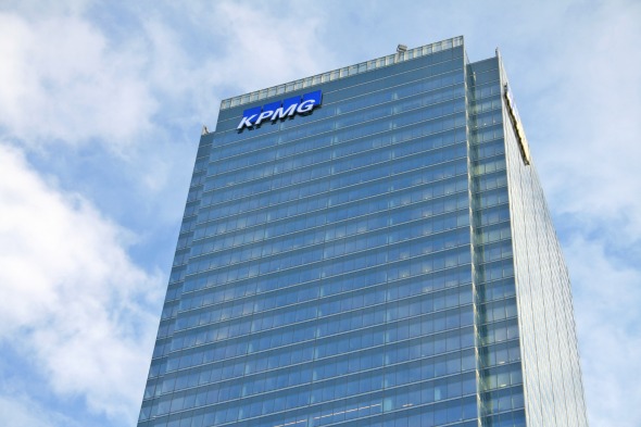
the pre-renovation appearance of First Canadian Place
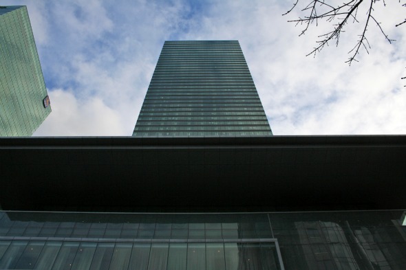
with the dark stone-clad buildings around the city.
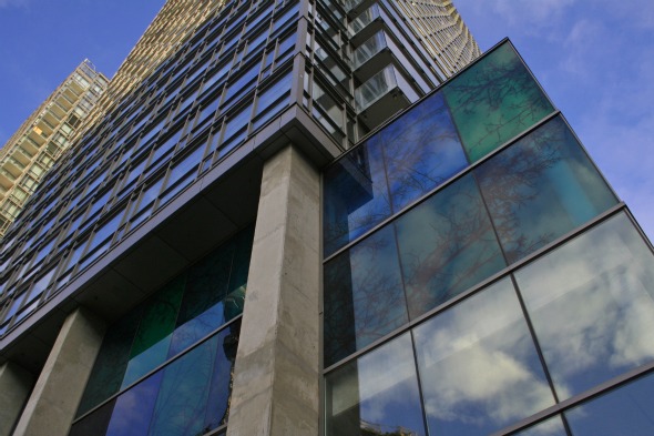
They are also background colours. When a risky, expensive office tower is going up, the last thing an investor wants is something as simple as an offensive colour choice ruining the ability of the building to gain tenants. The Bay Adelaide Centre Tower has taken this to the furthest extreme: on some days, the tower seems to fade so inoffensively into the background that it is literally difficult to see.
For condos, a similar problem occurs. Condos are the equivalent of a mass-produced item - like a car - but stuck together in one building. And what are the most popular car colours?
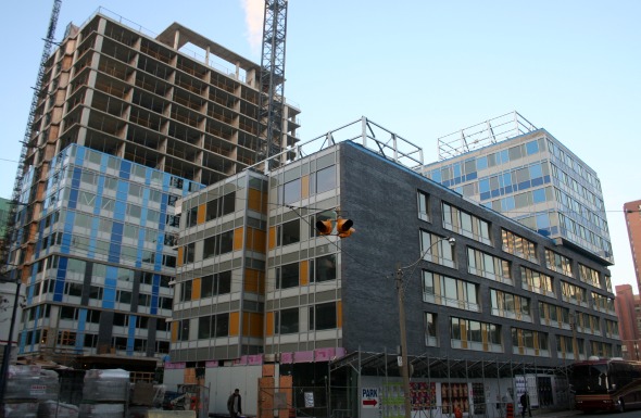
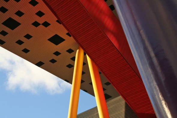
Silver, white and black. If only 7% of car purchasers are willing to go for niche colours like pink or purple, why would a condo developer make their building such an unpopular colour?But even with these powerful forces keeping colours in check, they've begun (ever so slowly) to creep out. Alsop's Sharp Centre for Design (the OCADU building) threw some primary colour splashes our way in 2004. As Alsop says, "[Colour] is refreshing. It aerates the city." He points out that Moscow (a city that shares some similarities to Toronto, climate-wise) was actually quite colourful in the pre-Revolutionary period: "Moscow was full of colour before the Revolution. It doesn't get much sunlight. It was built in the wrong place, basically. Under the czar, they introduced colour by painting the buildings vibrant colours."But even in the conservative condo market, colour has started to make an appearance, particularly as accents. This seems like one of the few ways designers and architects can smuggle bold colour choices into a building's design. The Murano condominiums have colour accents at their base. X condominiums on Ted Rogers Way splash Mondrian-like colour on the building's basic black palette. But none of them go as far as the YWCA Centre behind the bus terminal.This building uses an orgy of strange colours. Although it may not be to everyone's taste, it stands out against Toronto's palette. (And it probably helps that it's low income housing: the residents don't have the option of being fussy about what the outside of their home looks like.)
And maybe this is the core of the issue. While we bemoan the lack of colour, when bold colours are chosen, they often don't appeal to most people. Maybe rather than blaming the architects for the city's lack of architectural colour, we should perhaps ask why Torontonians themselves seem afraid of colour?
Latest Videos
Latest Videos
Join the conversation Load comments


