
New in Toronto Real Estate: Casa 3 Condos
Casa 3 Condos is one of a slew of developments going up in the soon to be tower-dominated Bloor and Yonge area. Located just east at Church St., the building follows in the footsteps of Casa and Casa II, and is obviously being put together by the same developer, Cresford.
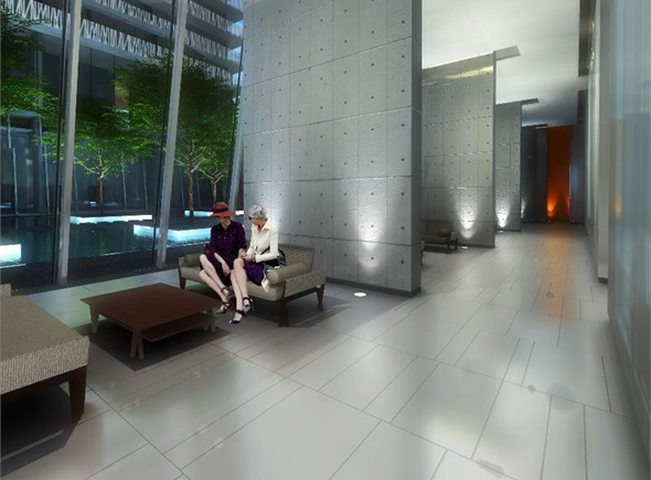
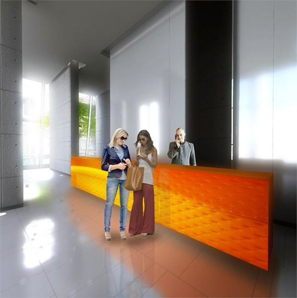
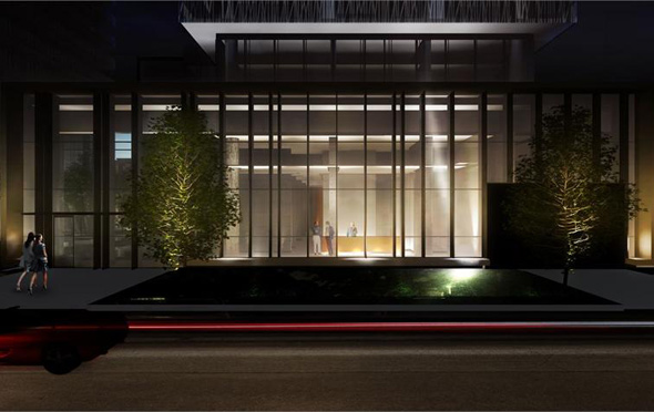
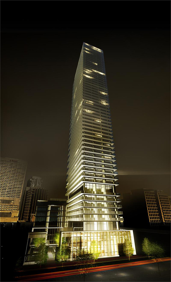
Now, I know this is Toronto, and I know the signs thus far point to a lack of imagination (there has to be a better name than "House one, two and three"), but honestly, the developers are pushing it a bit here. The exterior is a simple, soaring, 56-storey tower, and it looks like a caricature of a glass condo. It's basically what condo haters rail against and judge all condos to be. But, hey, the lobby will feature furniture by Hermès, making this property utterly fabulous and Euro-chic, right?
SPECS
Address: 50 Charles St. E.
Floors: 56
Total number of units: N/A
Unit sizes (in square feet): 312-690
Prices from (available units): $239,900
Maintenance fees: $0.58
Developer: Cresford Development Corporation
Amenities/building features: Gym, games room, guest suite, rooftop deck, pool, party room, movie room and 24-hour concierge.
THE GOOD
You can't have a more central location than Casa 3. It's right next to Bloor-Yonge station, it's near Ryerson, and close to pretty much all the retail you'll ever need. If you work downtown, it's a pretty ideal spot. And, though small, the units are (mostly) affordable.
While many would bemoan the lack of floor space, it's totally possible to transform a small condo into a fully functional living environment. The key is just to own the space, not be afraid to employ the use of statement furniture and lighting, and floor to ceiling wall shelving to create (the illusion of) space.
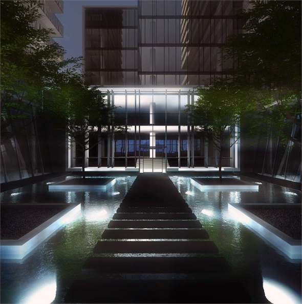
This building also looks like it'll be a good spot to entertain. The pool looks lovely, especially for night swims. Ah, the joy of renderings. And it comes with all of the standard condo amenities.
THE BAD
According to the information available thus far, these condos are pretty teensy. The studio layout looks smaller than a dorm room, with the bed basically on top of the kitchen area. (Check out some of the floor plans here). From looking at the plans, these suites look like they'll provide about the same quality of life as a run of the mill hotel room. The brightness factor is also a concern. Many of the suites appear to have one wall with large windows, but that's it. The units will likely tend to be quite dark toward the back.
All of this said, I can't imagine the developers will go without designing larger suites once plans are finalized. It's still early days— the property isn't due to be finished until 2017.
OUR TAKE
If location trumps charm and originality when it comes to your hunt for a living space, Casa 3 is a good bet. The building is in a super-central spot, and as I've said, a little imagination can turn a boring, tiny condo into something spectacular.
Read other posts in this series via our Toronto Condos and Lofts Pinterest board.
Latest Videos
Latest Videos
Join the conversation Load comments


