The best and worst TTC subway stations in Toronto
The architecture and design of the TTC is often overlooked whether on account of its fundamentally utilitarian purpose or because the aesthetic trends of the 1950s and 1970s don't tend to resonate with us to the same degree that they once did.
Nevertheless, there are some real gems in the subway network and, alas, a few duds too. Here are my picks for the best and worst TTC subway stations.
BEST
Dupont
Opened in 1978, Dupont is a perennial favourite of TTC riders for its mosaic tiles, dome entrances, and built-in benches. The attention to detail here is far greater than at the vast majority of stations on the line, for which kudos should go to Dunlop-Farrow Architects.
Rosedale
Stop and consider how well Rosedale Station is integrated with the natural landscape in which it sits the next time you pass through. Its rounded entrance has an understated mid-century elegance, which was even more apparent with its original Vitrolite tiles.
Old Mill
Many would argue that Old Mill is the fairest TTC subway station of them all on account of its predominantly glass walls that look out over the Humber Valley. Unlike Rosedale, there's some protection from the elements at platform level, but you still feel outdoors.
Sheppard West
The nicest of the newer TTC stations until the Spadina Extension opens, Sheppard West (previously Downsview) was designed by Adamson Associates Architects and Stevens Group Architects and opened in 1996. I've always loved the way that that ceiling is rounded at platform level before opening into a multi-storey atrium on the way to the bus bays.
Yorkdale
This Arthur Erickson-designed station might be chilly in the winter, but its glass arcade aesthetic is bright and airy in a way that so few TTC stops are. It'll be even better when Michael Hayden's Arc en ciel light sculpture returns to the ceiling later this year.
Queen's Park
The closest you'll get to riding the London Tube in Toronto is Queen's Park and its sister station St. Patrick, both of which were hollowed out using a tunnel boring machine so as to lessen the impact of construction on the nearby hospitals. Which station you prefers is usually a matter of colour preference.
Museum
Oh, Museum. Sure to be the most divisive entry on this list, some love the themed design while others lament the loss of a near perfectly preserved 1960s subway station. For my part, I think the novelty of the design is worth kudos even if the budget never allowed for the work to seem entirely finished.

Be careful how you enter Dundas Station. Photo by Chewie.
WORST
Dundas
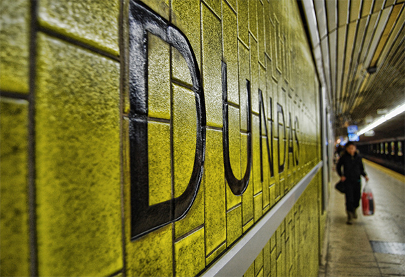
Aside from the mucus-green tile, Dundas has a crucial design flaw that nails tourists visiting the Eaton Centre on an everyday basis. You can't change platforms without leaving the paid-fare zone. Locals might know that presenting a transfer to the opposite fare collector would work, but most people who make the mistake don't know to do that.
Dundas West
There are a few problems to note here, the first and most obvious being that the station needs an easterly exit, which will probably come way down the line when Metrolinx tries to better integrate the UP Express. Beyond that, the platform level of the station is just ugly with a mix-match of tiles at the escalators heading up to the mezzanine.
Wilson
Once the terminus of the Spadina Line, Wilson is the TTC station time forgot. Ignoring the fact that the platform acts as a sort of wind tunnel in the winter, it's one of the less intuitive stations to navigate, and its elevated position in the median of Allen Rd. makes it feel something like a giant concrete coffin.
Bessarion
Bessarion is actually a rather nice-looking and accessible TTC station. The question is merely why it exists in the first place.
A note on criteria: This list aims to take stock of the architectural and aesthetic merits of various TTC stations. Construction at stations has not been factored into this list as it's a temporary condition. It should be noted that accessibility is an important design feature as well, though the TTC is currently expanding the number of accessible stations as part of long term plans to improve the system.
Latest Videos
Latest Videos
Join the conversation Load comments


