
What Toronto's most stunning new subway station looks like now
Even though the opening of the TTC's Spadina Extension is a little under a year away, excitement is steadily building as we get more and more glimpses of the progress being made on the six subway stations that'll be added to Line 1.
Last week, we got a peek at the nearly finished Downsview Park Station, which will be the first of the new stops. It's certainly a nice looking addition to the TTC that departs from mid-century stations with a sweeping atrium at the entrance and a design that aims to bring natural light to multiple levels.
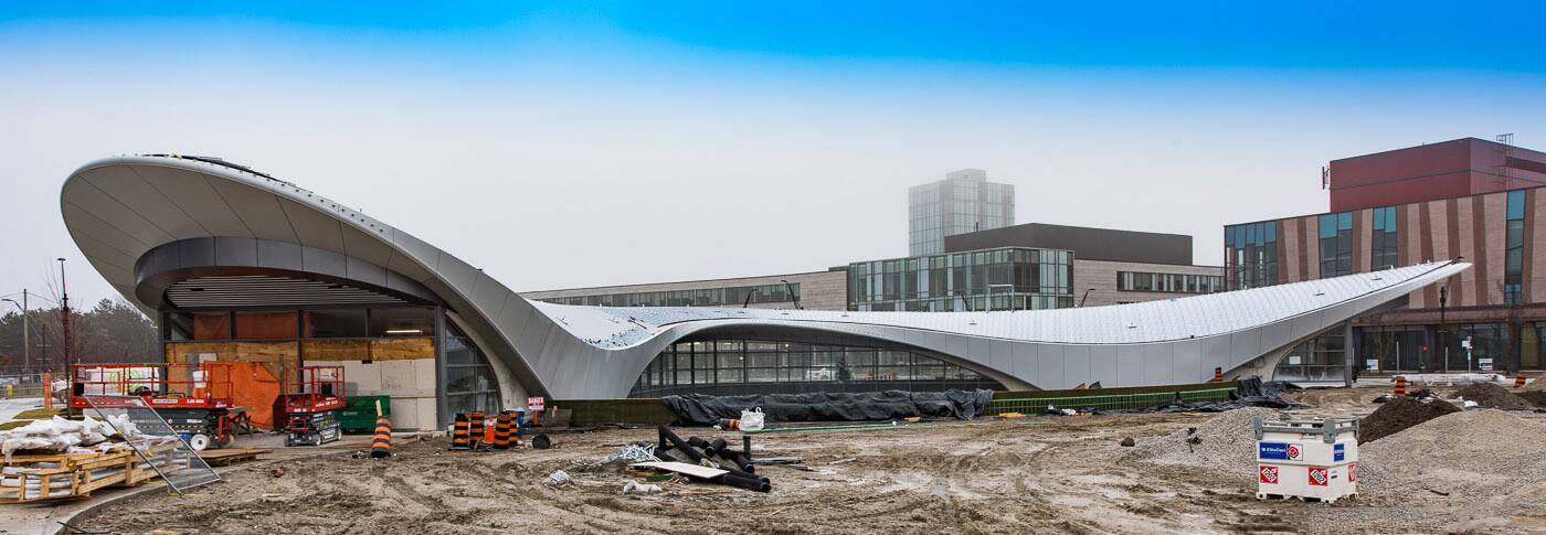
View of York University Station looking east southeast. Photo courtesy of the TTC.
As nice as it may be, however, the real gem of the new crop of subway stops is surely York University Station. Designed by Foster + Partners, not only will this be one of the busiest stops on the line, but it's one of those buildings that goes well beyond mere utility in the hopes of adding to a campus that's in the midst of an architectural awakening.
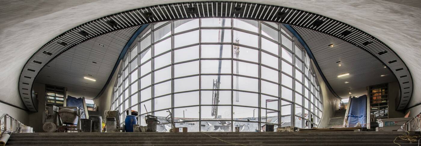
View of west-facing "light scoop" from concourse level. Photo courtesy of the TTC.
The sweeping roof that connects each station entrance provides a dramatic centrepiece in the York University Common, but it's also an environmental feature of the structure as its anodized aluminum panels reflect sunlight and absorb very little heat.
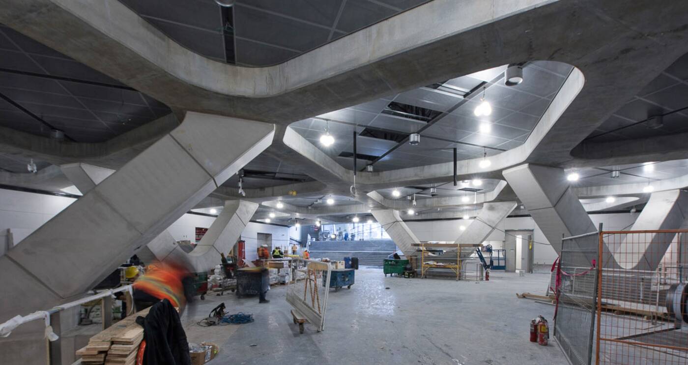
Concourse level nearing completion. Photo courtesy of the TTC.
The west-facing "light scoop" provides a stunning view for passengers exiting the station, but also allows for less reliance on electric light sources. Meanwhile the helix-like supports on the concourse level make the station appear futuristic without coming off as hokey.
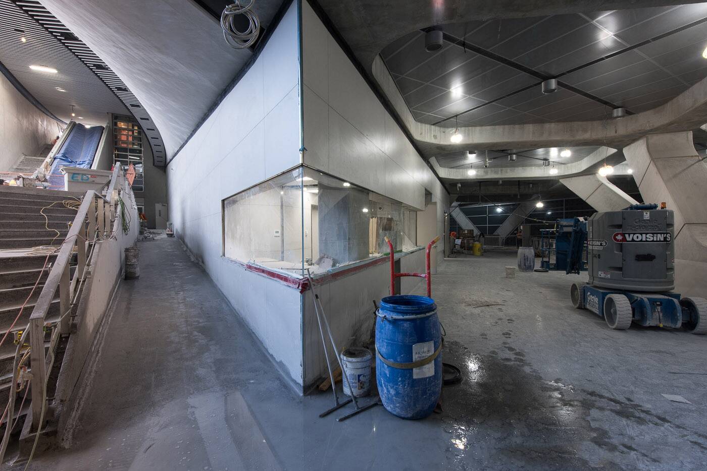
Customer service agent booth. Photo courtesy of the TTC.
For all the design features, perhaps the best feature of all is just how much the new station will change transportation at York. On weekdays, thousands of TTC bus trips are made through the Common each day, many of which will be made redundant once the subway extension opens.
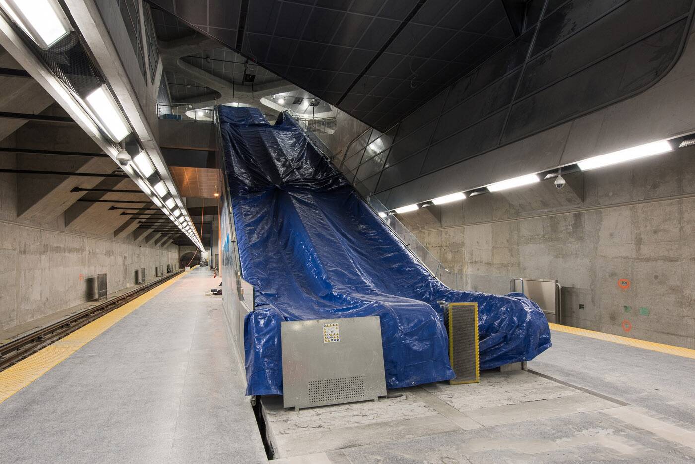
Lighting and terrazzo flooring has been installed at platform level. Photo courtesy of the TTC.
There's been talk of a subway at York for so long, and now that it's almost arrived, it looks better than many of us had ever imagined.
TTC
Latest Videos
Latest Videos
Join the conversation Load comments


