
The LCBO launches urban concept store
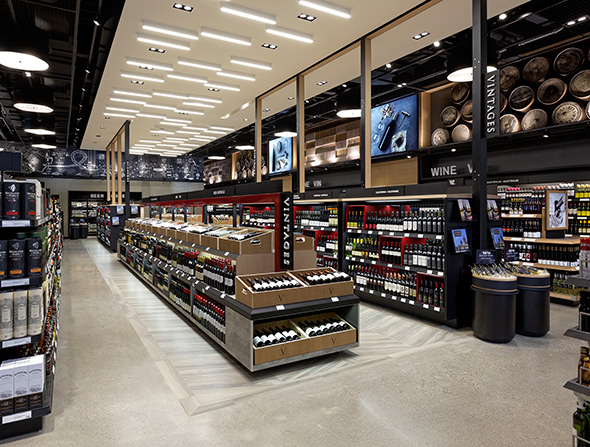
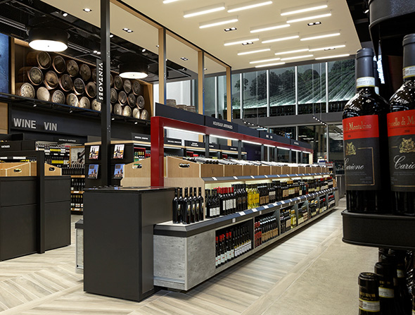
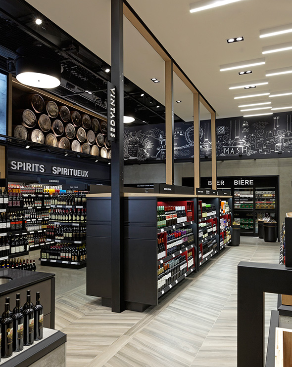
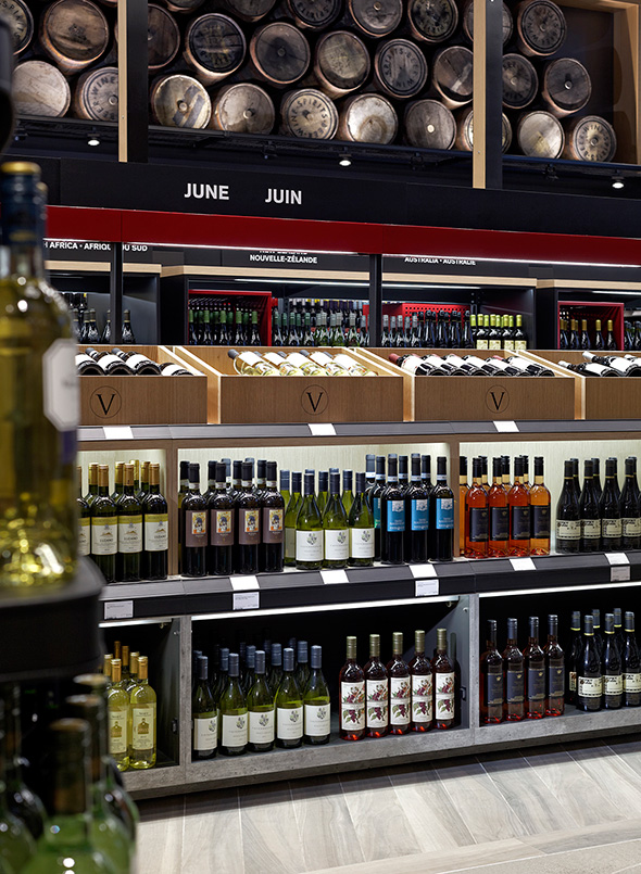
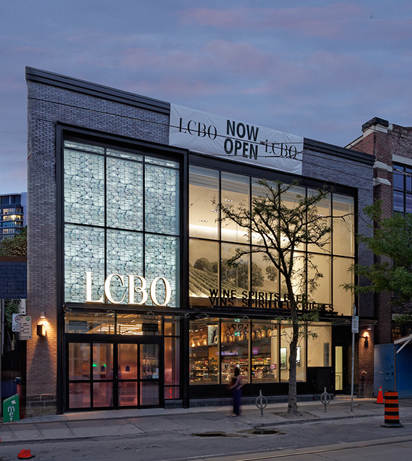
The LCBO is trying out a new look for some of its high density urban locations, the first of which has recently opened in the Beaches at 1986 Queen St. East. The new "urban concept store" is a bit like the Beer Store's Boutique location, where greater attention is paid to the design and layout of the store. It won't make the wine taste any better, but it might make wandering aimlessly reading labels a bit more enjoyable of an experience.
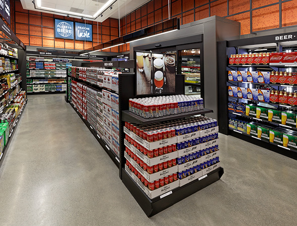
Key to these stores is the Vintages section, which is designed predominantly as a runway rather than the shelving systems used at most current LCBOs. Aside from the layout being prettier, this new design gives the section greater prominence. I suspect for more than a few wine buyers, the fact that the Vintages section is often tucked away at the back of the store is just a reason used to avoid it altogether. The beer section at this particular location is also larger, but what should be of more interest is the fact these stores carry a larger percentage of premium products, so the craft beer selection is better.
What do you think? Is this a better design for the LCBO?
Store design by II BY IV DESIGN / Photos by David Whittaker Photography
Latest Videos
Latest Videos
Join the conversation Load comments


