
IDS Shows Us The Future
This year's Interior Design Show not only exhibited what the ultimate in design is right now but also what the ultimate in design will be. On the northwest side of the Metro Toronto Convention Centre, a section called Designgennext (what a mouthful) exhibited work by students from Canada's top six design schools. From furniture to accessories, the work on display was more then impressive, demonstrating the sheer talent of these up-and-comers to the design scene.
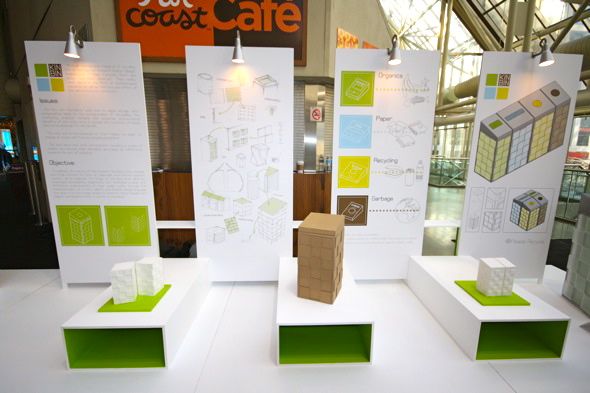
I really enjoyed the lego-inspired Kin Bin, produced by a design team from the Ryerson School of Interior Design. After researching the inadequacies of Ryerson's own recycling bins, second year students, Hayley Moore, Kieran Meschino, Rochelette Dumbrique, and Simone Ferkul, came up with this innovative concept -- a new and improved recycling bin made out of antibacterial materials.
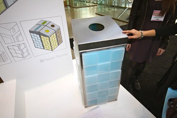
"We took a playful attitude toward recycling and were inspired by the modular connection of Lego," said Rochelette. "It's both durable, accessible, and necessary." Functional and easy on the eyes -- a designer's dream. What's even more cool is that the school is looking to get these "Rubik's Cubes" manufactured.
Chair prototypes by a talented group of OCAD students were also impressive.
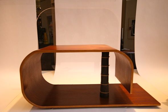
The bench pictured above by fourth year student Kyung Wook Min caught my eye. Made out of three elements -- plastic, glass and wood -- the sleek-looking piece is not only nice to look at but also practical. It can hold up to 300 lbs.
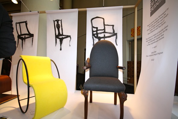
Farhad Shabani's Marcel Breuer-inspired bright yellow contraption (pictured on the left) was hard to miss. Flipped one way, it's a rocking chair -- turn it around, and the appropriately-titled "Flip Flop" becomes stationary.
The beautiful but odd shape of "New George" by Vincent J. Monastero (pictured on the right) also attracted a great deal of attention. Upholstered at a spot in the Beaches and made out of materials from around the area, everything about this delicate but surreal chair was local. With handles that appeared to be growing, it seemed like it was a part of nature. "People either love it or hate it," said Monastero. Count me in the former group.
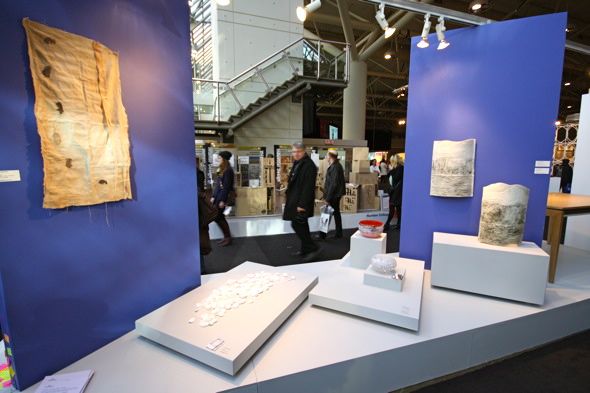
It seemed as if Sheridan's Craft and Design Program chose simple and elegant student work to display.

Made out of spruce and paint, these 2 x 4 wall hooks, created by Sheridan student Jordan Murphy, are simple but beautiful. "I was playing with the idea of the construction of houses when I made these," said Murphy.
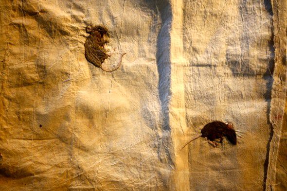
I absolutely loved Mousemeat by Simone Rauscher. Made out of unbleached cotton and polyester thread, it wasn't until I was super close that I realized the brown splotches on the cloth were not stains, but in fact, mice.
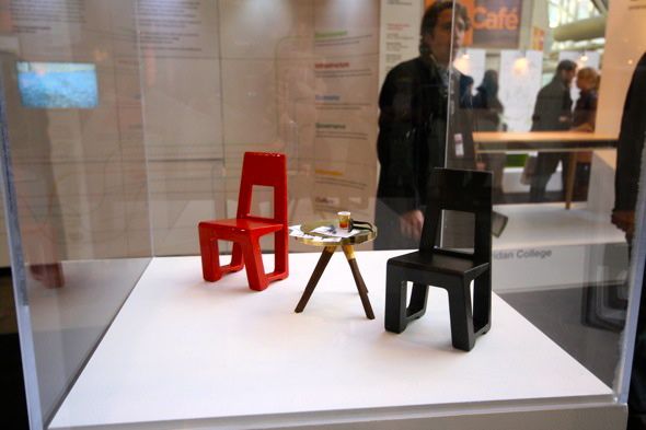
Students from the University of Alberta had tiny samples of their work on display in glass cases. The side table, entitled Hank, by Anna Docherty, and the chairs, Profile 6 by Bram Sowntsky, were both elegant and cute (maybe because they were so tiny). I'd love to see both in actual size.
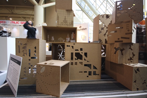
Other work on display included pieces by students from Humber College and George Brown that was equally impressive.
Latest Videos
Latest Videos
Join the conversation Load comments


