
The best and worst of IDS 11
The Metro Toronto Convention Centre was home to the annual Interior Design Show this past weekend. Every industry insider, student, and design enthusiast made their way downtown (some without subway access thanks to TTC track repairs - great timing) to see what all the fuss was about. Overall the show was slick, professional, and full of design eye-candy, but (as with all events) there is room for constructive criticism. Follow me through the ups and downs of IDS11.
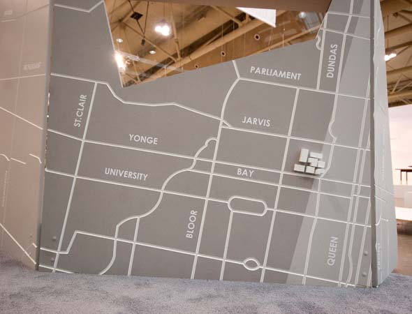
Thumbs Up: Canadian talent
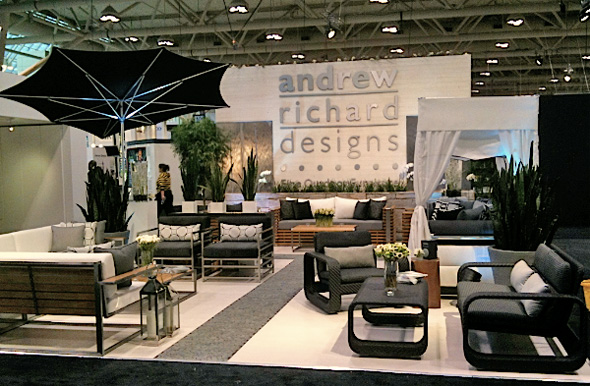
The Canadian design community had a lot to be proud of at this year's IDS. Not only did they smash the stereotype that everything Canadian-made is either wood or fur, but they showed us that genius design can come from the simplest of ideas. Andrew Ooi, a "free folding" artist from Toronto worked his magic with paper to create delicate lanterns for modern spaces. Gilbert VandenHeuvel of Goderich, Ontario showed off his furniture and accessories line, The Recycler, which uses old bike parts to create fun, modern, masculine pieces. Kevin Wiggers featured his innovative rotating panel designed to hide a big screen TV. And the crown jewel of Canadian outdoor furniture, Andrew Richard Designs got us pumped for patio season with their new high-end offering.
Thumbs Down: Too Conceptual
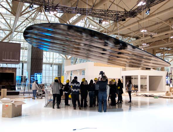
While we design-crazed folk appreciate the high-level thinking behind many of the booths this year, I didn't feel there were enough tangible, consumable products for a show that welcomed the general public. It was like the haute-couture, un-wearable creations you would see on a fashion designer's catwalk instead of the prĂŞt-a-porter items in their flagship
store.
Thumbs Up: Casey House First Seating
This fundraising campaign for Casey House (the first free-standing HIV/AIDS hospice in Canada) gave us all a spectacular idea of the variety of skills, vision, and creativity of some of Canada's top designers (interior and otherwise). Beginning with a plain white Vitra Panton Chair, each designer was given the task of decorating and reinterpreting it to convey their own design aesthetic. With each finished product displayed side-by-side, it was such fun to compare, contrast, and pick out my favourites.
Thumbs Down: New Product Launches
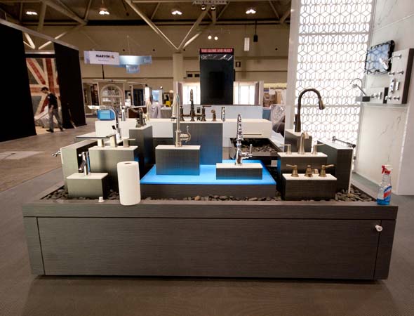
The lead-up to IDS11 boasted tons of new products to be launched in the Canadian market, and while the coverage prior to the event highlighted each one, the new products were hard to pin down at the show. Instead of standing out, new products such as Ceramic Tiles of Italy, Alfred Sung's Blackwatch collection, and Caesarstone Canada's new colours were mixed in with the regular offering and perhaps not given the new glamorous treatment they deserved - the only exception to this being the launch of the Audi A-7 which attracted lots of drool and attention.
Additional photos:

Writing by Kelly Fallis. Photos by Dennis Marciniak with the exception of the one depicting Andrew Richard Designs', which comes via the company's blog.
Latest Videos
Latest Videos
Join the conversation Load comments


