
What's old is new again at IDS 2012
It's no secret that words like "reclaimed," "upcycled," and "vintage" are the buzzwords of late when it comes to interior design, but when they're used on the mega-design-platform that is the annual Interior Design Show in Toronto, these words are suddenly given a new notch of credibility.
Yet the allusions to vintage and salvage at IDS 2012 are subtler than, say, at your friendly reclaimed furniture shop. With the exception of booths such as that of Urban Tree Salvage, which boasts log round end tables and reclaimed wharf benches, many designers have seamlessly incorporated reclaimed steel into their displays (Ridgely Studio Works), vintage furniture along with new (Mazen Studio), and even borrowed ideas from centuries-old religious practice (Patty Johnson, "Vodunuvo").
But like any good interior design show, there's still plenty of design and technological innovation, meaning a glut of powder-coated aluminum and appliances that take the guesswork out of seemingly every type of household task.
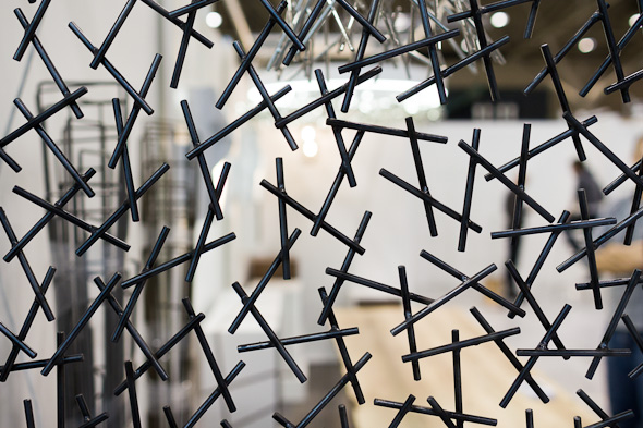
I got a sneak peek of this year's show during a media tour, which started with an introduction to the "Strip Tease" entrance exhibit. Unfortunately, the exhibit was not as exciting as its name might suggest, though I know there must be some people who get a special thrill out of salvaged felt. Before heading up to the showroom floor, we toured the Onsite/Offsite space, which is new to the main level this year.
Guiding us through the exhibit is IDS co-founder and vice president Shauna Levy, who tells us that the nine designers and six school invited to participate were asked to create something "interactive." While Moss & Lam's mammoth dancing polar bears and certainly fun and whimsical, they strike me as more "observe and enjoy" than "this would look great in the living room."
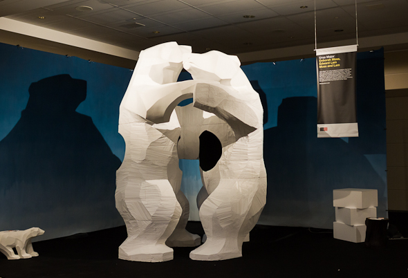
Onsite/Offsite has a mix of the gallery-worthy and the pragmatic, including works by Kathryn Walter, whose felt designs are featured in the newly designed Melody Bar, and DesignGenNext showcases by Canada's leading design schools.
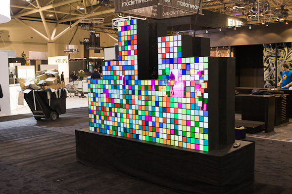
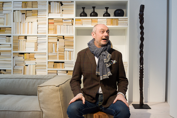
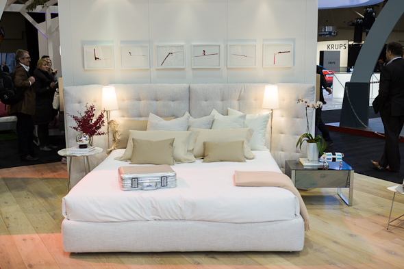
Next, we ascend to the main IDS space, which features 300 exhibitors of up-and-comers right through to multinational companies. Obviously, there were several that stood out from the pack, including that by IDS 12 International Guest of Honour Piero Lissoni. The beautiful, sleek white space was characterized by ivories, nudes, and beiges; colours borrowed, it seems, by the pages of aged books stocking every inch of the exhibit's bookshelves. When prodded, Lissoni simply described the space as, "A white space. With some furniture inside."
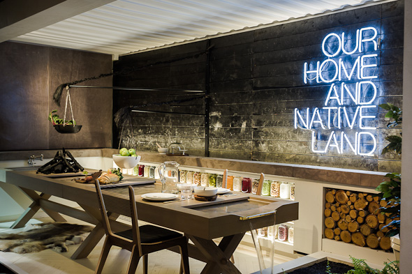
Another highlight was getting to know the Toronto-based design teams participating in the "How Do You Live?" exhibit, which focused on multi-dwelling spaces. With the idea that many homeowners in the city are living in tight condo spaces with rooms that serve more than one function, the design teams of Tas DesignBuild, Mason, Jill Greaves Design, Mazen Studio, L'Atelier, Casey Design, and Quadrangle Architects each took the inside of actual shipping containers and transformed them into multipurpose, beautiful spaces. My pick was Mason's bathroom/kitchen hybrid (I know, I know), which featured a running fountain running through a kitchen counter.
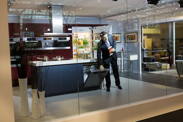
The oddball award goes to the Miele display, which featured a fully decked out kitchen, living room, and "fashion station," all of which was behind glass, with the president of Miele Canada pacing behind. "Welcome to the Apple of high-end appliances," he said into his headset microphone, which boomed through the speakers on the outside of the display. Hear that, investors? Get your pens ready.
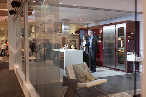
We were then treated to a short skit about poor Mrs. Cooper, who was trying to explain that her car was stolen to a detective who was more interested in her three-chamber wine fridge. I couldn't tell if they were trying to be funny-funny or ironic-funny, but it was a shame not to be able to actually touch the appliances.
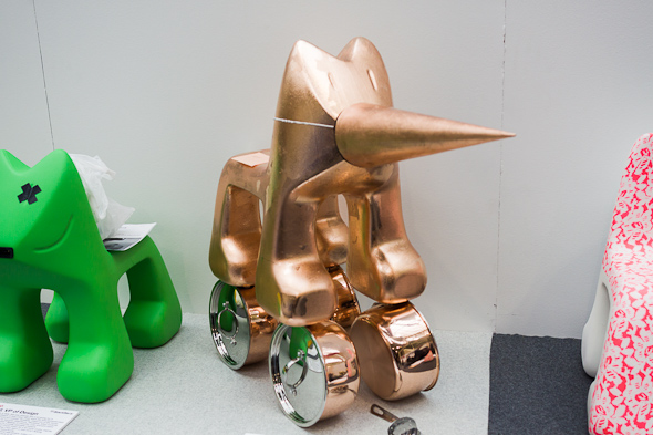
My hands-down favourite exhibit of the show came right at the end. On display near the exit are 20 Magis Julian chairs that have been "re-imagined" by various designers. There's the "Buddy" chair by Philip Sparks, covered in the signature Mongolian lamb hair that's used in many of his pieces; Debbie Travis' "Painted Dog" of multicoloured paint splotches, toting markers in his pack; and Joe Mimran's "Catwalk" chair, which is wearing a bright orange neoprene coat, characteristic of everything that is Joe Fresh.
While the chairs will be auctioned off in support of ONEXONE during the opening night party, the exhibit will be on display all weekend. And it's probably best to call them "re-imagined;" leave "upcycled" for Queen East.
Additional Photos:
Photos by Tom Ryaboi
Latest Videos
Latest Videos
Join the conversation Load comments


