Mercer Union
I've been meaning to check out the new location of the Mercer Union for quite some time. Although I live pretty close by, this was just one of those things that kept getting pushed back. But, with the new year still young, and my resolution to visit some new galleries fresh in my mind, I decided it was now time to knock this off the old to-do list.
Those familiar with the Mercer Union will know that it used to be located on Lisgar Street, just south of Queen and Dovercourt in the heart of Toronto's "Art+Design district". Feeling the pressure of condo development in the area, early last year the folks at the Mercer decided that it was time to move north to the greener pastures of Bloor West. While not the artistic hotbed that Queen West is, there is a burgeoning gallery community in the Bloor and Lansdowne area. A block to the west of the Mercer is the Toronto Free Gallery , directly across the street is the Paul Bright Gallery , and a hair to the east is the recently opened Funktion Gallery . So perhaps the Mercer's break from condo pressure will be short-lived. Once the galleries move in, you know the condos are on the horizon! And, in this case, quite literally. A short walk up Lansdowne to Dupont and (further to) Davenport reveals the development machine in full gear, converting warehouses into lofts, recession aside.
The Mercer officially moved last March, though it's still receiving some finishing touches. The gallery space is, however, up and running. One of the coolest tidbits I learned about the new location during my visit was that the late 19th century building was designed by Toronto architect E. J. Lennox, responsible for, amongst other things, Casa Loma . Numerous businesses have occupied the space over the years, the most recent of which was a dollar store. Needless to say, it's pretty nice to see the Mercer take over as the inhabitant of this space. It seems like the building deserves it (so, yes, despite my vague worry about the condos up the road, at heart I still can't deny my affection for gentrification). Remaining from the original design are the historic facade and the Victorian tin-panel ceiling. Beyond these niceties, the space is also 1000 square feet larger than the Mercer's former home.
This extra space allows the Mercer a few interesting additions. Along with the main gallery, there is a more intimate space in the rear, which will see audio and video installations featured often. Also planned is a workshop with an in-house technician who will help artists to design site-specific installations with greater creativity and ease. And, my personal favourite, near the front of the building there is also a small room that has been designed to accommodate artists whose work keeps them at the gallery until the wee hours.
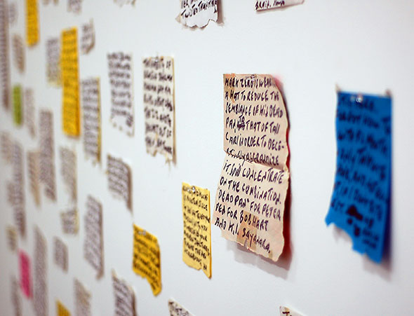
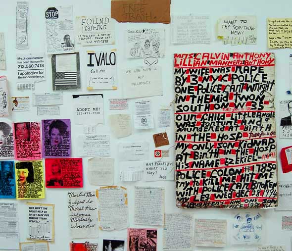
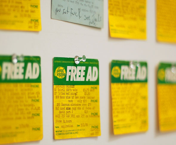
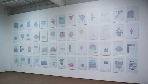
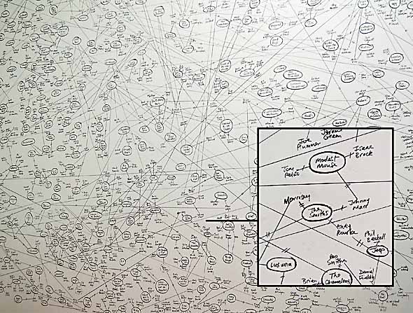
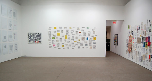
But all this about the building, what about the art? The Mercer's primary focus is on contemporary artists (from both Canada and beyond). In keeping with this, the main gallery exhibit (running until February 14th) features selections from UbuWeb , an Internet resource devoted to the avant-garde and outsider arts founded by the poet, Kenneth Goldsmith. A mix of found-art and concrete poetry by David Daniels, the exhibit asks some provocative questions about both artistic appropriation and the complex interaction between art and the archive. True to form, the back gallery sees Craig Leonard's Amusicolgy , a series of installations that explore convergences between art and rock music, which includes a huge lattice-like chart on the back wall that follows various musicians and the bands they've been a part of over their careers.
