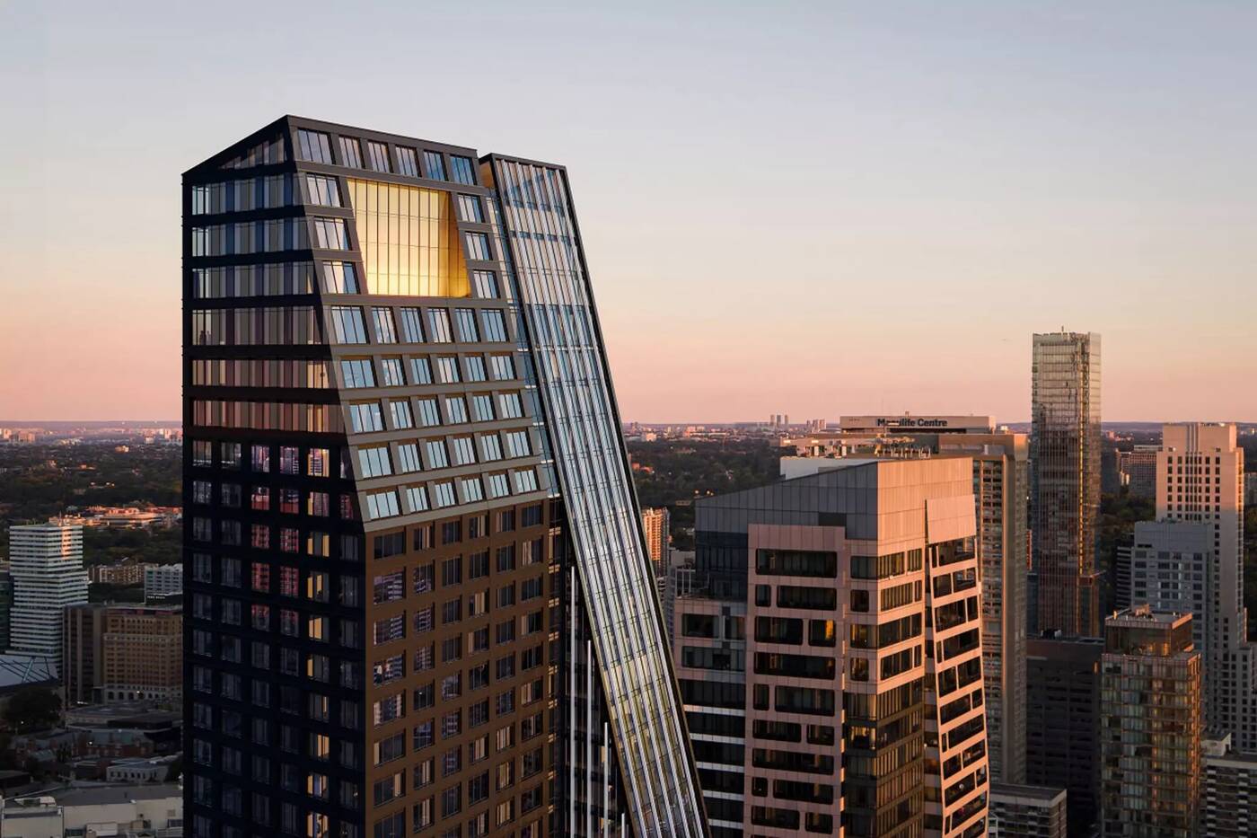
A simple Toronto planning rule has created a big wave of similar-looking towers
Toronto's Yonge Street has been buried in an avalanche of high-rise proposals over the past several years, but some are noticing that many of the recent towers in the works for the busy street's stretch through downtown look… well… kind of similar.
We're not saying the proposals in this group look identical, but they all share a few design traits in common. The most apparent shared detail on these towers is their strikingly similar upper sections, which lean dramatically away from the main street below at the same 75-degree angle.
You'll find these projects on a stretch spanning from roughly Bloor Street in the north to College Street in the south, extending just east and west of Yonge Street, in an area dubbed the Historic Yonge Street Heritage Conservation District (HCD).
The majority of buildings on this stretch date from between 1860 to 1954, and the HCD was created in 2016 in an effort to guide new developments and their relationship with the heritage buildings below.
The Yonge Street HCD requires developments to retain historic frontages and be set back ten metres from the street, the reason all new towers planned and under construction in the area are pushed well back from the roadway.
But even more visible are the HCD requirements imposing a 75-degree angular plane from the street below, resulting in the proposals all sharing a trademark angle at their upper floors. Together, these rules work to prevent the character of Yonge Street from being overwhelmed by the flood of new development.
A 75 degree angular plane is imposed upon a stretch of Historic Yonge Street in Downtown Toronto. The policy has resulted in several 'intriguing' geometric profiles of buildings designed to accommodate these guidelines. @CityPlanTO#Toronto #CityofTO #urbanplanning #development pic.twitter.com/F8xnm7KDFP
— Future Model Toronto (@FutureModelTO) January 25, 2022
Stephen Velasco, a digital marketer known for his elaborate 3D city model (and an equally impressive earlier cereal box model constructed in his younger days), created the diagram above comparing new projects along Yonge.
He tells blogTO, "there's no mistaking that recent developments along this section of Yonge Street have shared a similar design language, with clearly defined setbacks or sloped facades. These lines are invisible to the naked eye, and most people wouldn't even know they existed or why the buildings look the way they do."

Sloped facade of 8 Wellesley Residences At Yonge, now under construction. Rendering by IBI Group.
Sure, the HCD is resulting in some very similar shapes on the skyline, but before people rush to slam a policy that seems to promote uniformity, a similar planning rule implemented over a century ago is responsible for perhaps the most recognizable skyline in the world.

Like 8 Wellesley, the recently-proposed 15 Charles East features a sloped facade with a terrace carved away. Rendering by IBI Group.
One only has to look to the New York City 1916 Zoning Resolution to see the potential of what could otherwise be seen as a restriction on creativity.
Like the Yonge Street HCD implemented exactly a century later, New York's 1916 rule was adopted in an effort to preserve sunlight for streets below, requiring tall buildings to have tiered stepbacks as they rise. It may have caused headaches for architects of the era, but this policy shaped icons like the Chrysler Building and Empire State Building.
"It's fascinating to see how developers, architects and urban planners are working around these guidelines to make developments feasible from a cost and end-user perspective," says Velasco.
Very nice buildings, not the boring box shape. Critics of this I guess they love to live in basements without sun 😁
— Edgar J. Rodríguez (@Kensalgestar) January 25, 2022
There are other concerns about the Toronto policy, though, with complaints that the "structural gymnastics" involved for these smaller upper levels result in some less-than-ideal unit layouts.
10 St. Mary looks like it’s about to topple.
— Emily Farina (@EmilyFarina5) January 26, 2022
Others see it as a trade-off prioritizing sunlight over much-needed housing, an argument that has been applied to other Toronto planning policies setting angular plane requirements.
Angular planes kill affordable housing, yet they are mandated by @CityPlanTO.
— Jacob Loo Dawang (@jacoobaloo) January 16, 2022
This report is amazing for visualizing and quantifying how the City's Official Plan, zoning and design guidelines all come together to make affordable housing nonviable. https://t.co/9avX9IIc4W pic.twitter.com/LRShs8r2Gh
Velasco seems to agree that it's a serious question, saying, "whether or not policies like this should be prioritized is debatable, especially with recent concerns over housing supply."
Still, he admits that "when the dust has settled, the policy will have created a streetscape identity that urban enthusiasts will be studying for years to come."
IBI Group
Latest Videos
Latest Videos
Join the conversation Load comments


