An iconic Toronto building's brand-new addition is already generating controversy
Change is no easy pill to swallow, and resistance to new things — especially the type of things that involve construction — is common in a city changing as fast as Toronto. But that resistance can persist even after the cranes are removed and the project teams pat themselves on the back for a job well done.
The University of Toronto's Robarts Library has become an icon of the educational institution since its 1973 opening, but also a symbol of the bold architectural style known as Brutalism that still divides critics a half-century later.
Its concrete-forward form has been compared to both a fortress and a giant turkey, a polarizing style that you either love or hate, with little ground in between. It's rather fitting that such a polarizing building now has an equally polarizing addition, with finishing touches wrapping up the new Robarts Common wing added to the west side of the building.
Robarts Common, the newest addition to #RobartsLibrary @UofT @uoftlibraries was featured in the @globeandmail. The article by @marcusbgee details the soft opening this past week and our design of the expansion. https://t.co/JIYd8wR4aB
— Diamond Schmitt (@DiamondSchmitt) March 28, 2022
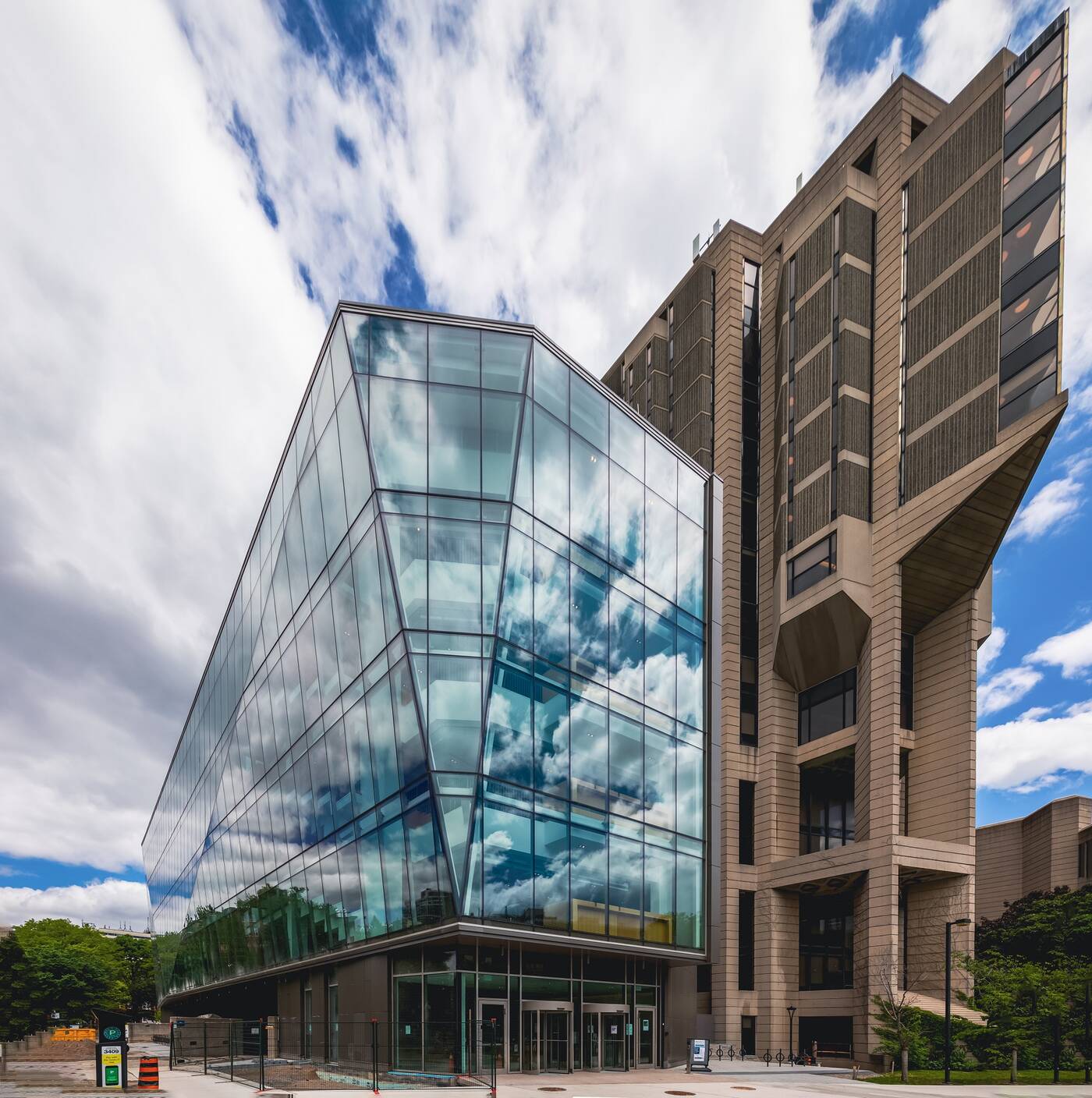
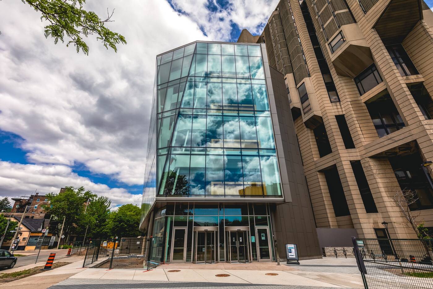
Designed by Diamond Schmitt Architects, Robarts Common brings a five-storey wing that contrasts sharply against the second through fifth floors of the existing Robarts Library building, relieving the cramped library with 1,200 desperately-needed individual and group study spaces.
A soft opening was held in late March ahead of the official Fall 2022 launch, giving U of T students early access to the new space.
@UofT’a new addition to Robards, Robarts Common, is probably one the best study spots I have ever used. It’s coming in absolute handy for exam period 💪🏼 pic.twitter.com/4NI33Atl6m
— Masato Webb 正人 (@masato_webb) March 30, 2022
Students' positive reviews have been plentiful, but the juxtaposition of the new floating glass jewel against the existing library's heavy concrete mass isn't sitting right with everyone.
While thoroughly integrated with the Brutalist landmark, the addition has faced criticism for being visually disconnected from its parent building.

One U of T alumni commented that the new addition is "an ugly and totally foreign huge and distracting glass growth on a unique conception and facade," while another described the building with a memeworthy line from The Godfather, saying, "look how they massacred my boy."
Voices in the architecture world have called it an "out-of-sync appendage," while still defending its impressive qualities. And, for what it's worth, it has many.

When you can look past the context, the addition itself is actually quite a stunner, its crystal-clear glass envelope creating a sort of floating terrarium of students going about their business.
Behind its angular facade, cascading staircases and floating boxes finished in wood are on display for passersby.
This same clear glazing and prominent west-facing facade combine for some spectacular light-filled spaces that offer a clear improvement over the darkened study areas within the 1973 building.
And on top of the redeeming aesthetic qualities, the U of T student population is only expanding, and facilities constructed almost 50 years ago will have to grow to support these changes.
It may not be everyone's cup of tea, but neither was Robarts a half-century earlier. So perhaps we should all withhold judgement for a decade or two.
Jack Landau
Latest Videos
Latest Videos
Join the conversation Load comments


