Designing for Touch and Surface
For a good hour, the cynic inside me kept telling me it was just a table, and an expensively priced one at that. But my inner five-year-old, as it turned out, was really the one running the show; while an expensive table it may be, my fingers simply couldn't resist.
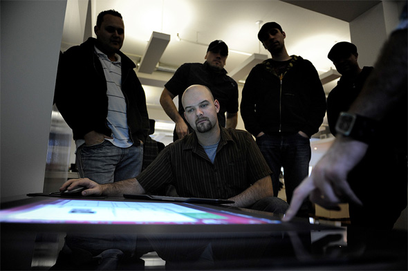
The table in question is officially known as the Microsoft Surface, a multi-touch enabled computer screen released last year that is literally set into the top of a table. Ignoring the numerous, power-at-the-tip-of-a-finger clichĂŠs, Microsoft promises that the table will present a new and intuitive way for users to interact with their computers.
While not intended for consumers just yet, the device has slowly been finding its way into the hands of software developers, businesses, and design firms like teehan+lax - one of the few Toronto-based companies who have begun exploring the possibilities this sort of technology may hold.
"We recognize that it's a new, emerging platform, and something completely different," Jeremy Bell explained to me at the teehan+lax office, "and that's really what interested us in it."
Bell, along with the rest of teehan+lax, are primarily developers of web-based interfaces. Chances are, if you've ever done any banking on BMO's website, or checked your Air Miles online, you've seen some of the company's work. That being said, Bell is quick to admit that designing applications with touch in mind is a very different way of working than what the company is used to.
"You have to design these things where anyone can walk up and interact with it," explained Bell, as Brendan Lynch, teehan+lax's primary Surface developer, demonstrated the software.
" I can do my thing, and you can do your thing. For a design philosophy, it's completely different."

So what exactly does this mean for users? Remember that, with a regular computer screen, there's usually only one user interacting. The Surface, meanwhile, is designed for multiple people, and even more fingers; in fact, the table is designed to respond to 52 individual touches at once. This, of course, poses the challenge of maintaining simplicity amongst potential chaos; everything on the screen has to be easily available to multiple people, all at the same time.
But how does this sort of technology fare in real world applications? Microsoft says the intuitive nature of the device makes it perfect for social settings - in particular, bars, hotels, or other settings centered around social interaction. Just last month, for example, Canadian realtor Coldwell Banker demonstrated their own Surface app in Toronto, which the company hopes to eventually see in a number of their sales locations.
After spending about an hour with Bell and Lynch, I can see why the people at teehan+lax are excited to begin developing potential Surface applications for clients. Interacting with the Surface, if designed right, can be simple, even for inexperienced computer users.
Of course, the device has its shortcomings, some of which have posed interesting problems for Lynch. The Infrared cameras, for example, can't detect pressure, meaning developers are somewhat limited in the way users can interact with the table. Also, darker materials can prove difficult for the cameras to detect, while direct sunlight can also render the machine inoperable.
To be fair, the technology has enough positive qualities and potential applications to balance out its kinks. Having been in the wild for just over a year, more companies like teehan+lax are beginning to explore the possibilities it could hold for clients, meaning it may just be a matter of time before the device sees more widespread use throughout the city.
Just don't plan on buying one for your basement anytime soon, cautions Bell.
"The reality of this thing is that it costs so much, that it's not going to be inside of a home any time soon."
To see more pictures of the teehan+lax Microsoft Surface, check out the company's blog.
Latest Videos
Latest Videos
Join the conversation Load comments


